SaaS Website Design: 10 Best Practices for B2B SaaS Websites

TL;DR: Good SaaS website design makes a complex product simple for each buyer who evaluates it. Lead with a clear outcome, give every persona its own use cases, publish pricing, put named proof beside your claims, pass Core Web Vitals, and structure pages so AI search can cite them. For most B2B SaaS marketing sites, build on Webflow.
- Homepage: the hero earns the next 10 seconds. The rest of the page carries use cases and proof, at whatever length the decision needs.
- Buying committee: give the user, budget holder, technical evaluator and security reviewer each a page that answers their questions.
- Pricing: publish it, or at least a starting price and the pricing model. It's buyers' top request of vendors.
- Proof: named customers, specific results and third-party reviews, placed next to the claims they support.
- CTAs: two paths on every key page, one for researchers and one for ready buyers.
- Speed: pass Core Web Vitals on mobile (LCP ≤ 2.5s, INP ≤ 200ms, CLS ≤ 0.1). Only 48% of mobile sites do.
- AI search: question-based headings, direct answers, schema and one consistent company description.
- Accessibility: fix contrast, form labels and keyboard access. 95.9% of top home pages fail basic WCAG checks.
- Editability: a component system plus CMS, so marketing ships pages without developers.
- Measurement: track conversions and AI referrals separately, and only A/B test once you have the traffic for it.
Platform pick: Webflow for most SaaS marketing sites. Use a different stack for your product app, docs, or programmatic pages at very large scale.
What makes B2B SaaS website design different?
B2B SaaS website design means building a marketing site that explains a product people can't touch yet, earns trust from several stakeholders, and supports a long buying cycle that mostly happens without sales. It has to serve a researcher, a budget holder and a technical evaluator, often weeks apart.
Three things set it apart from a typical B2C site.
- The product is invisible, and it does a lot. You're selling software the visitor hasn't used, with several use cases, so the site has to make an abstract workflow feel concrete and pick which parts to show whom.
- More than one person buys. TrustRadius found that 53% of small-business purchases and 39% of mid-sized ones peak at buying groups of two to three people. Enterprise groups most often run to four or five.
- The cycle is long. In the same research, 87% of buyers finished their purchase within six months. That's up to six months of different people returning to your site to check things.
Nielsen Norman Group's B2B usability research covers 293 B2B websites tested with business users, and the resulting report runs to 188 design guidelines. That tells you how many ways these sites can go wrong. The practices below are the ones I see make the biggest difference.
1. How should a SaaS homepage explain a complex product?
A SaaS homepage should make a complex product feel simple in stages. The hero earns the next ten seconds with one clear outcome for one clear audience. The sections below carry the use cases, personas and proof. The page ends up as long as the buying decision needs.
Most SaaS homepages I audit get this wrong in one of two directions. Either the headline says something like "The future of work, reimagined," which could describe an office chair, or the hero tries to explain the entire product in one screen.
What should the hero section actually do?
The hero should create enough clarity to earn the next ten seconds of attention. It doesn't have to explain the whole product. State the outcome, who it's for and the category in plain words, with one primary CTA. Features, use cases and integrations belong further down the page.
The common advice is "a good hero explains everything." I disagree. Cram the full value proposition into one screen and you get bloated, generic messaging: three benefits squeezed into a headline, a subhead listing every persona, and a visitor who remembers none of it.
Here's a structure that holds up:
- Headline: the outcome, in the buyer's words. For example: "Close your books in 3 days instead of 12."
- Subhead: category + audience + mechanism. "Accounting automation for finance teams at 50–500 person companies. Reconciliations run overnight."
- Visual: the real product, cropped to the moment of value. An abstract 3D shape tells nobody anything.
- CTAs: one primary, one secondary at most.
Your visitor usually has two or three competitor tabs open, and Gartner found buyers prefer self-service when searching for general information and learning new things. The hero only has to give them a reason to keep reading yours.
The test we run is simple. Show the hero to someone outside the company for five seconds, close it, and ask what the product does and who it's for. If they hesitate, the copy isn't done.
One more thing on category. If you're inventing a new category, anchor it to an existing one first. "Zapier for finance ops" gets understood. A term nobody searches for doesn't.
How long should a SaaS homepage be?
As long as the decision requires. Visitors don't care about page length. They care about finding enough information to take the next step with confidence. A complex product with several personas usually needs a longer homepage, as long as every section answers a real buyer question and the page is easy to scan.
"Keep your homepage short" is the other piece of advice I'd push back on. A founder evaluating a platform that will touch four teams needs to see how it works for each of them, what it connects to and who else uses it. Cut that for the sake of brevity and they'll go looking for it somewhere else, often on a competitor's site.
What keeps a long page easy to read:
- One job per section, with a heading that says what the section answers.
- A predictable order: outcome → how it works → use cases by persona → proof → pricing or CTA.
- Scannable layout: short paragraphs, real product visuals, and the CTA repeated every two or three sections so ready buyers don't have to scroll back up.
- Links to depth. The homepage summarises each persona and use case. Dedicated pages go further.
2. Who is your SaaS website actually designing for?
A B2B SaaS website is designed for a buying committee, not one visitor. Each persona needs the benefits and use cases that matter to them, with how the product works as context. Map every role (user, budget holder, technical evaluator, security) to a page that answers their questions, and link those pages from the main navigation.
Nielsen Norman Group frames this as designing for both "users" and "choosers": the people who'll use the product and the people who pick it. They look for different things.
A simple committee map:
- User / champion: feature pages, use-case pages, product tour, templates. Their question: "Will this make my week easier?"
- Budget holder: pricing, ROI proof, case studies with numbers. "Is this worth it, and is it a safe bet?"
- Technical evaluator: integrations, API docs, status page. "Will this break our stack?"
- Security / procurement: trust centre, compliance certificates, DPA, SSO details. "Can we sign this?"
The page most SaaS sites skip is security. If you hold SOC 2 or ISO 27001, show it, and let people request the report without booking a call.
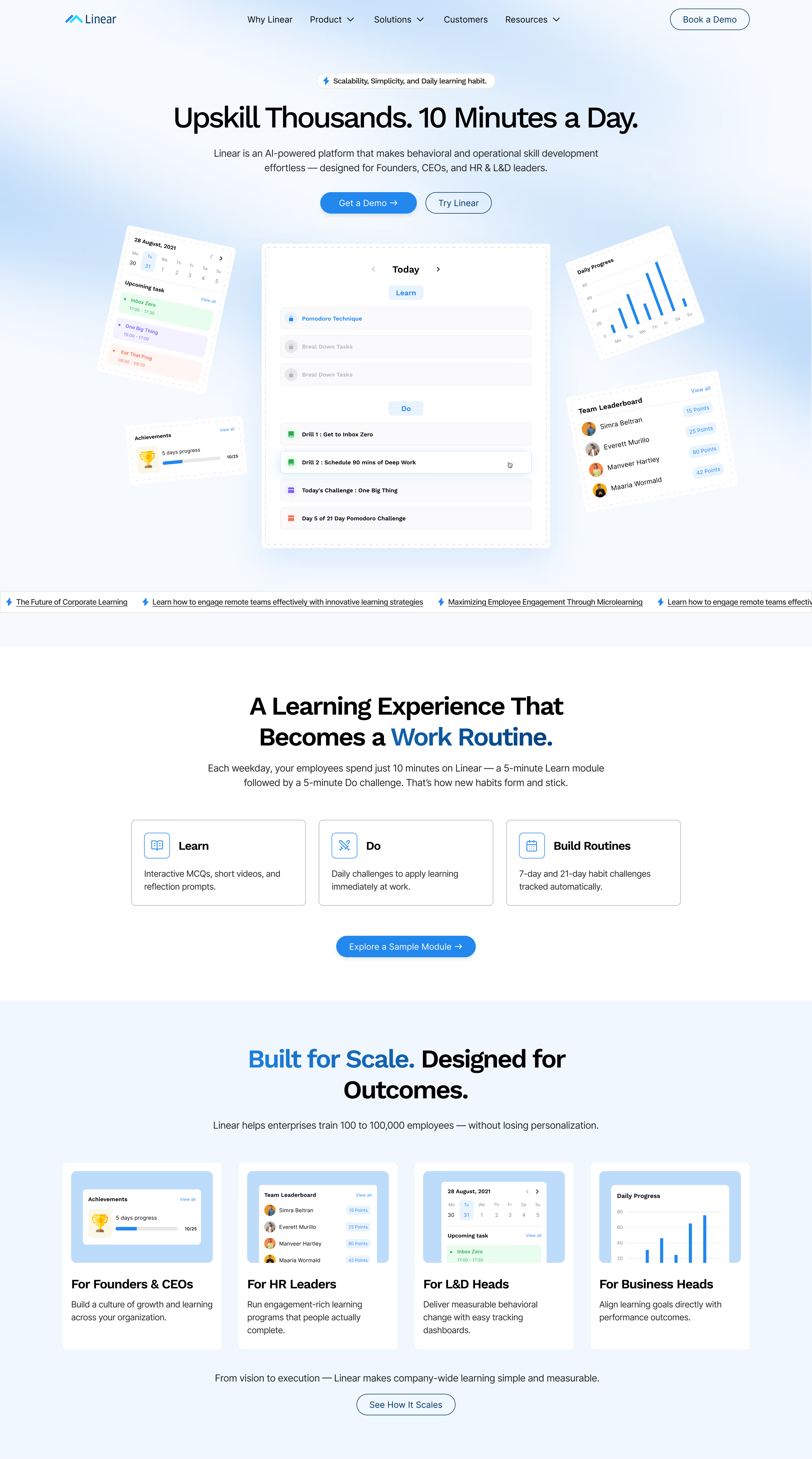
We ran into the persona problem head-on when redesigning the site for Linear, an AI-powered platform for behavioural and operational skill development (not the project-management tool of the same name). Linear sells to founders, CEOs, HR leaders and L&D teams, and each group needs something different from the product. The old site's navigation didn't serve any of them, and visitors left without understanding what Linear offered. In the redesign we gave the product section four persona tracks, each with its own role-specific features and benefits, and ordered the pages around the buyer journey.
Your navigation should follow the same map. "Solutions" by role or industry. "Product" by capability. "Customers" or "Resources" for proof. And a visible "Pricing" link in the top nav. When pricing is buried in the footer, the budget holder assumes it's expensive.
3. Should a B2B SaaS website show pricing?
Yes, in nearly every case. Transparent pricing has been buyers' top wish-list item for vendors four years running in TrustRadius research. Even enterprise-only products should publish a starting price or a pricing model, what's included, and what pushes the cost up, instead of a lone "Contact sales" button.
The data on this is unusually consistent. TrustRadius has asked buyers what they want from vendors every year since 2023, and transparent pricing has come out on top each time. Its 2022 study found 81% of buyers want to find pricing information on their own.
The usual objection: "Our deals are custom. A number will scare people off or anchor us too low." Reasonable worry. You still have options besides a blank wall:
- Publish a "starts at" figure for the entry tier and label the top tier "Custom."
- Explain the pricing model (per seat, per usage unit, per workspace) so buyers can estimate.
- List what moves the price: volume, SSO, support SLA, onboarding.
- Add a pricing FAQ for procurement questions: annual vs monthly billing, contract length, overage rules.
On the page itself:
- Put the plan most customers should buy in the middle and mark it. Three plans that look equally recommended make people stall.
- Keep the comparison table short. Show the 8–12 features that actually differ between plans and link to the full matrix.
- Put each tier's CTA directly under its price, not at the bottom of a 60-row table.
My view after building a lot of these: an honest pricing page does some of sales' qualification work before the first call.
4. What proof do B2B SaaS buyers actually trust?
B2B buyers trust proof they can check: product demos, free trials, named case studies with specific numbers, and third-party reviews. A row of logos on its own does little. Place your strongest proof right next to the claim it supports, rather than parking every testimonial on a page nobody visits.
In its 2026 report, TrustRadius found buyers ranked product demos, free trials, prior experience and user reviews among the most influential resources when choosing a vendor. The same report found 94% of buyers who used AI fact-check its answers at least some of the time. They're checking everything, and that includes your claims.
In practice:
- Name the customer and the number. "Acme cut onboarding from 14 days to 4" does more than "Great tool, highly recommend!" from "J.S., Marketing Manager."
- Put proof beside the claim. If a feature section says it cuts reporting time, the quote about reporting time goes right there.
- Show the product. An interactive tour or a 90-second unedited walkthrough beats polished motion graphics.
- Link to your reviews on G2, Capterra or TrustRadius. Sending people off-site feels risky. To a buyer it looks like confidence.
Case studies need a structure too. Ours runs: the customer's situation before, the specific problem, why they picked you over the alternatives, what they implemented, the measurable result, and a quote from the person who owns that result.
On the Linear redesign, the old site had enterprise customers and real traction, yet almost none of it was visible: no trust indicators, little social proof, and no conversion-focused CTAs. We put enterprise client callouts and outcome testimonials next to the claims they back up, instead of on a separate page. Linear's co-founder, Santhosh Sarangan, summed up the result: "Our website finally reflects the quality and ambition of what we're building at Linear."
And don't inflate anything. A buyer who fact-checks AI answers will fact-check a testimonial that sounds too good.
5. How should CTAs work across different buying stages?
Give every key page two paths: a low-commitment action for researchers (product tour, pricing, a template) and a direct action for ready buyers (start a trial or book a demo). Most B2B visitors aren't ready for sales on their first visit, so a lone "Book a demo" button leaves most of your traffic with nowhere to go.
Gartner's 2026 survey found 67% of B2B buyers prefer a rep-free experience, up from 61% the year before. That doesn't mean they never want sales. Another Gartner study found 69% of buyers turn to sales reps to validate AI-generated insights. They'll talk to you later, when they choose to.
Design for that:
- Primary CTA matches your sales motion. Product-led? "Start free." Sales-led? "Book a demo." Hybrid? Lead with whichever path produces more revenue, not more clicks.
- Secondary CTA keeps researchers moving: "Take the product tour," "See pricing," "Watch a 3-minute demo."
- Labels say what happens next. "Get a demo" works. "Submit" and "Learn more" tell the visitor nothing.
- Forms stay short. Every extra field serves your sales process, not their need. Name, work email and company size is usually enough for first contact. Enrich the rest afterwards.
Then fix what happens after the click. A demo form that ends at "Thanks, we'll be in touch" wastes the moment the buyer is most interested. Embed a scheduler so a qualified lead can book a slot right away.
6. How fast does a SaaS website need to be?
Fast enough to pass Google's Core Web Vitals on mobile: Largest Contentful Paint within 2.5 seconds, Interaction to Next Paint of 200 milliseconds or less, and Cumulative Layout Shift of 0.1 or less, measured on real users at the 75th percentile. Fewer than half of mobile sites pass all three.
Those are the official thresholds from web.dev. Most of the web misses them. The HTTP Archive's 2025 Web Almanac found only 48% of mobile sites pass all three, and 62% of mobile pages reach a good LCP.
Speed pays in B2B specifically. In the Deloitte study Google published as "Milliseconds Make Millions," a 0.1-second improvement in mobile speed led to 21.6% more lead-generation visitors progressing to the form submission page. That's from one tenth of a second.
Where SaaS sites usually lose time:
- Autoplay hero videos that weigh more than the rest of the page combined.
- Lottie files and GSAP animations that all fire on load instead of on scroll. We use GSAP on most builds. It's fine when it's scoped.
- Uncompressed product screenshots. Export as WebP or AVIF, sized to the container.
- Third-party script pile-up: chat widget, two analytics tools, a heatmap, three ad pixels, an A/B testing script. Audit these every quarter.
- Web fonts: four weights of two families when you use three styles in total.
Check field data in Google Search Console or PageSpeed Insights. A Lighthouse score from your own fast laptop doesn't count.
7. How do you design a SaaS website that AI search engines will cite?
Structure pages so an AI system can lift a clean answer: question-based headings, a direct 40–60 word answer under each, specific facts with sources, FAQ schema, and one consistent description of what your company does. Buyers increasingly see an AI summary before they see your site, and those summaries pull from pages built this way.
This is Answer Engine Optimization (AEO), also called GEO. It matters because buyer research has moved. TrustRadius found 63% of software buyers used AI during their purchase journey in 2026. A year earlier, 72% of buyers had come across Google's AI Overviews during research, and 90% of them clicked through to a cited source.
That click is the opportunity. If your page is the cited source, the visitor arrives with context and intent.
What to build into the design:
- Question-shaped H2s that match how buyers phrase prompts: "How much does X cost?", "Does X integrate with Salesforce?"
- Answer first, detail after. The bold paragraphs in this article follow that pattern on purpose.
- Honest comparison and alternatives pages. Buyers ask AI tools to compare vendors. Give the model a page worth citing.
- Schema markup: Organization, SoftwareApplication, FAQPage, Article. In Webflow you can add JSON-LD per page and fill values from CMS fields.
- Consistent entity description. Describe your company the same way on your site, LinkedIn, G2 and Crunchbase.
- Presence beyond your site. TrustRadius notes AI answers lean heavily on reviews, independent publications and peer content. Your own site is only part of what gets cited.
8. Why does accessibility matter for a B2B SaaS website?
Accessibility widens your market, lowers legal risk, and can come up in enterprise procurement. Most sites fail basic checks: WebAIM's 2026 scan of the top one million home pages found detectable WCAG failures on 95.9% of them, averaging 56.1 errors per page. The common failures are cheap to fix during design.
The WebAIM Million 2026 numbers moved the wrong way, up from 94.8% of pages the year before. WebAIM links the rise partly to heavier pages and more AI-assisted coding. The top error types barely change year to year: low-contrast text, missing alt text, missing form labels, empty links, empty buttons and a missing document language.
For SaaS sites specifically:
- Contrast. Light grey text on white looks refined in Figma and fails in real use. Check every text colour against WCAG AA: 4.5:1 for body text.
- Forms. Visible labels, not placeholder text alone, and error messages that say what went wrong.
- Motion. Respect the reduced-motion setting for scroll animations.
- Keyboard. Tabs, accordions and pricing toggles all need to work without a mouse.
Is there a legal angle? It depends where and to whom you sell. The European Accessibility Act has applied since 28 June 2025 to a set of consumer-facing products and services, including online shops, across the EU. Pure B2B SaaS often sits outside its direct scope. If any part of your product or checkout serves EU consumers, ask your counsel. Separately, enterprise procurement teams may ask for an accessibility conformance report (often a VPAT), so it's cheaper to build it right the first time.
9. How do you build a SaaS website your marketing team can update without developers?
Build it as a component system on a visual CMS: reusable sections, a documented class-naming convention, and CMS collections for anything that repeats, such as blog posts, case studies, integrations and changelog entries. Your marketing team should be able to launch a campaign landing page in an afternoon without filing a ticket.
This is where SaaS sites quietly decay. The launch version looks great. Six months later, marketing needs a landing page for a campaign, the developer who built the site has moved on, and someone bolts on a page that matches nothing else.
How we prevent that on our Webflow builds:
- A naming system. We use Client-First by Finsweet, so any Webflow developer can open the project and understand it.
- A section library. Heroes, feature grids, logo bars, testimonial blocks and CTA bands, built as components with editable properties.
- CMS for anything repeatable. Integrations, case studies, customer logos, job listings, glossary terms, comparison pages. Since May 2026, Webflow's Premium site plan includes 20,000 CMS items and 40 collections, enough for a serious content program.
- A style guide page inside the site showing every type style, colour and component in use.
- Short handover videos covering the ten tasks the team does most often.
For Linear, the CMS covers blog posts, case studies, whitepapers and events, so their team publishes all four without a developer.
Then watch the team build one real page on their own before calling the project done. Handover problems show up in the first week, while they're still cheap to fix.
10. How should you test and improve a SaaS website after launch?
Treat launch as the point where measurement starts. Set up analytics with defined conversion events, review behaviour monthly, and test one high-impact element at a time (hero headline, pricing layout, demo CTA) on your busiest pages. On low traffic, skip A/B tests and talk to buyers instead.
Track these from day one:
- Conversion events: demo requests, trial signups, pricing page visits, and form starts vs completions.
- Traffic source, with AI split out. Create a custom channel group in GA4 for referrers like chatgpt.com, perplexity.ai, gemini.google.com, claude.ai and copilot.microsoft.com, so AI visits don't disappear into "Referral."
- Scroll depth and clicks on the homepage and pricing page.
For testing, Webflow now has Webflow Optimize, a native A/B testing and personalisation tool that can target visitors by firmographics such as industry and company size. That's handy for account-based marketing: a fintech visitor can see fintech proof. It's a paid add-on, so it earns its keep once you have enough traffic to reach statistical significance.
Below that level, five customer interviews and a handful of session recordings will teach you more than a test that never finishes. Most early-stage SaaS sites don't have the traffic for meaningful A/B tests, and that's fine. Talk to the people who bought.
Which platform is best for B2B SaaS website design?
For most B2B SaaS marketing sites, Webflow is the best fit. Designers get full visual control, marketers get a CMS they'll actually use, and hosting, security and performance come without a plugin stack. Pick something else if your site needs heavy logged-in functionality, or content at a scale beyond Webflow's CMS limits.
Why does Webflow work for most SaaS marketing sites?
Webflow suits most SaaS marketing sites because the marketing team can own them. Pages ship without developer queues, there are no plugins to patch, hosting sits on a global CDN, and the platform holds SOC 2 Type II. Paid site plans start at $15 a month, cheap next to the pipeline a good site supports.
- Marketing owns the site. Visual editing plus CMS means campaigns ship on marketing's schedule.
- Security is handled. There are no plugins to maintain. On WordPress, Patchstack recorded 11,334 new ecosystem vulnerabilities in 2025, 91% of them in plugins, with a weighted median of five hours from disclosure to first mass exploitation for the most-targeted flaws.
- Enterprise-ready hosting. Webflow's hosting includes a global CDN, DDoS and bot protection, and SOC 2 Type II, CCPA and GDPR compliance. Enterprise plans add a 99.99% uptime SLA and SSO, which helps when your own security review asks where the marketing site lives.
- Growth tools in the platform. Native analytics and Optimize for testing and personalisation, with localisation available too.
- Price. Paid site plans start at $15 a month, and the CMS-ready Premium plan at $25 a month, both billed yearly.
When isn't Webflow the right choice?
Skip Webflow when your "website" is really an application: logged-in dashboards, user accounts, or heavy server-side logic. Look elsewhere for developer documentation too, and for programmatic SEO beyond 20,000 CMS items on a self-serve plan. Plenty of SaaS teams run Webflow for marketing and a separate stack for the app and docs.
Cases where I'd steer a client away from Webflow:
- The product app itself. Build it in your application framework. Keep the marketing site on the root domain and the app on a subdomain.
- Docs. Dedicated docs tools such as Mintlify, GitBook or Docusaurus handle versioning and code samples better. Link to them from the Webflow site.
- Programmatic pages at huge scale. If you need 100,000 generated pages, look at Webflow Enterprise's higher limits or a headless setup.
- An in-house React team that wants the site in code. A headless CMS with Next.js can be the right call. Just be honest about who will edit it at 6pm the night before a launch.
A split stack is normal. The marketing site exists to create pipeline, and Webflow is very good at that.
What should you fix first on an existing SaaS website?
Fix things in order of revenue impact: the homepage hero first, then pricing, then proof, then speed, then everything else. You may not need a full redesign. A lot of SaaS sites need sharper messaging and a rebuilt pricing page long before they need new visuals.
Here's the audit order I use, with one question per step:
- Hero: can a stranger say what you do, and for whom, after five seconds?
- Pricing: can a budget holder estimate cost without a call?
- Proof: is there a named customer with a number near every major claim?
- CTAs: does a researcher have a next step besides "Book a demo"?
- Speed: do you pass Core Web Vitals on mobile field data?
- Committee pages: do the user, budget holder, technical evaluator and security reviewer each have a page?
- AI search: would an answer engine find a quotable answer to your buyers' top ten questions?
- Accessibility: do contrast, form labels and keyboard access pass?
- Editability: can marketing ship a landing page without a developer?
- Measurement: are conversions and AI referrals tracked separately?
My rule of thumb: three or more "no" answers and the site is probably costing you pipeline. That's the work Missing Piece Studio, a Webflow agency for SaaS and B2B, does every day. If you want a second pair of eyes on yours, book a discovery call.
Frequently asked questions
How much does a B2B SaaS website cost?
Cost depends on page count, how much strategy and copywriting is included, and CMS complexity. At Missing Piece Studio, a focused two-week Sprint build is $1,200, and custom multi-page engagements with full strategy start at $2,000. Freelancers usually cost less, and large agencies often charge several times more.
How long does it take to design and build a SaaS website?
A focused single-page or launch site takes about two to three weeks. A full multi-page SaaS site with discovery, sitemap, wireframes, visual design and Webflow development usually takes six to ten weeks. Copy is the most common cause of delay, so settle your messaging before design starts.
Is Webflow good for SEO on a SaaS website?
Yes. Webflow outputs clean HTML, gives you control over meta tags, URLs, redirects, canonical tags and schema, and generates a sitemap automatically. Hosting on a global CDN helps Core Web Vitals. Rankings still depend on content quality and page speed, which comes down to how the site is built.
Should a SaaS website use Webflow or WordPress?
Choose Webflow if your marketing team wants to own the site without depending on developers and you don't want to manage plugin security. Choose WordPress if you already run a large WordPress content operation with in-house developers. For most seed to Series B SaaS companies, Webflow is the simpler long-term choice.
How many pages does a B2B SaaS website need at launch?
Most B2B SaaS sites launch well with 8–12 core pages: homepage, product or features, pricing, one or two solution pages by role or industry, customers or case studies, integrations, security, about, and a demo or contact page. Add a blog and comparison pages once the core is converting.
About the author: Jahid Aktar is the founder of Missing Piece Studio, a strategic web design agency for SaaS and B2B service companies. 80+ projects, 4+ years specializing in design psychology and conversion-focused Webflow builds.
Get a website built for growth
If your SaaS website is getting traffic but not converting visitors into trial users, it might be time to look at how your website is structured.
At Missing Piece Studio, we help SaaS companies design websites that clearly explain their product and drive more signups.