Most SaaS founders think their biggest growth problem is traffic.
So they invest in:
- SEO
- paid ads
- social media
- partnerships
But after months of effort, the numbers still look like this:
- Traffic is increasing
- Visitors are browsing the site
- Trial signups barely move
If this sounds familiar, the problem probably isn’t traffic.
The problem is what happens when visitors land on your website.
Most SaaS websites aren’t structured around the sections that actually drive conversions. Instead, they focus on feature lists, long explanations, and generic marketing copy.
In reality, a small number of sections on your website are responsible for most trial signups.
When these sections are clear and well-designed, conversions increase dramatically.
In this article, we’ll break down five SaaS website sections that have the biggest impact on trial signups and how you can improve them.
Why Most SaaS Websites Struggle to Convert Visitors
Before we get into the sections, it’s important to understand why many SaaS websites underperform.
Founders often see symptoms like:
- High traffic but low trial signups
- Visitors leaving within seconds
- People scrolling but not converting
- Demo requests staying flat
The common assumption is that the problem is marketing.
But more often, the issue is clarity and structure.
Many SaaS websites:
- focus too heavily on features instead of outcomes
- assume visitors already understand the product
- hide the call-to-action
- fail to build trust quickly
When visitors don’t immediately understand what your product does or why it matters, they simply leave.
The goal of a high-converting SaaS website isn’t to add more sections.
It’s to get the most important sections right.
Let’s look at the five sections that typically drive the majority of trial signups.
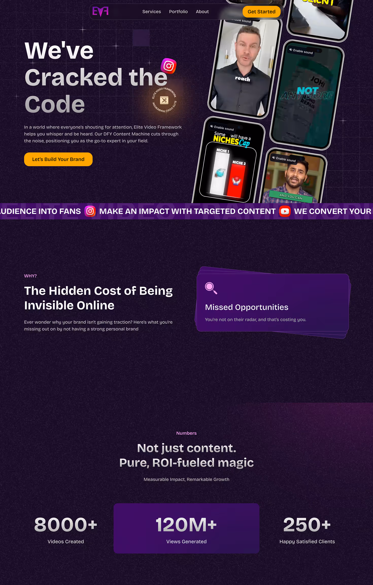
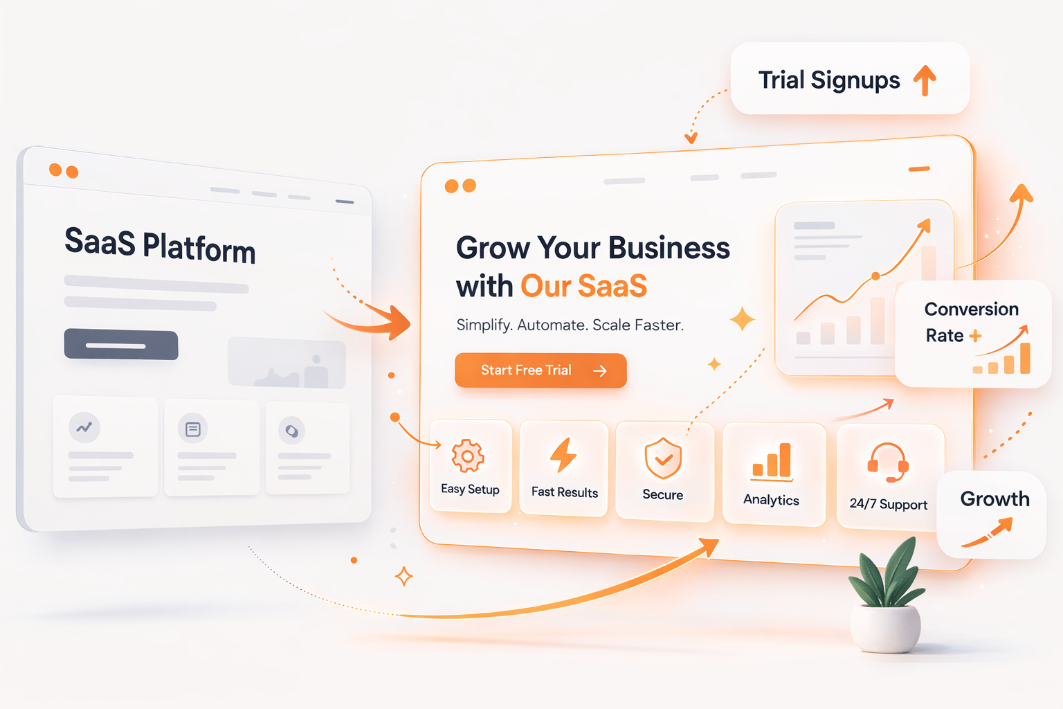
Section #1: The Hero Section (Where Most Decisions Happen)
Your hero section is the most important part of your website.
It’s the first thing visitors see when they land on your page, and it usually determines whether they stay or leave.
Most users decide within 3–5 seconds if your product is worth exploring.
If the hero section is unclear, confusing, or vague, visitors won’t continue scrolling.
A strong SaaS hero section usually includes three elements.
1. A Clear Value Proposition
This should explain what your product does and who it helps.
Weak example:
“AI-powered workflow automation platform”
Better example:
“Automate customer onboarding and reduce setup time by 80%.”
The difference is clarity and outcome.
2. A Primary Call-to-Action
Visitors should immediately know what step to take next.
Common SaaS CTAs include:
- Start free trial
- Book a demo
- Try it free
The CTA should be visually prominent and easy to click.
3. A Product Visual
A product screenshot or interface preview helps visitors quickly understand what the product looks like.
Examples include:
- dashboard screenshots
- UI animations
- product walkthrough videos
When visitors can see the product in action, they’re more likely to trust it.
A simple test for your hero section is this:
If a stranger landed on your homepage, would they understand your product in five seconds?
If not, your conversions are probably suffering.

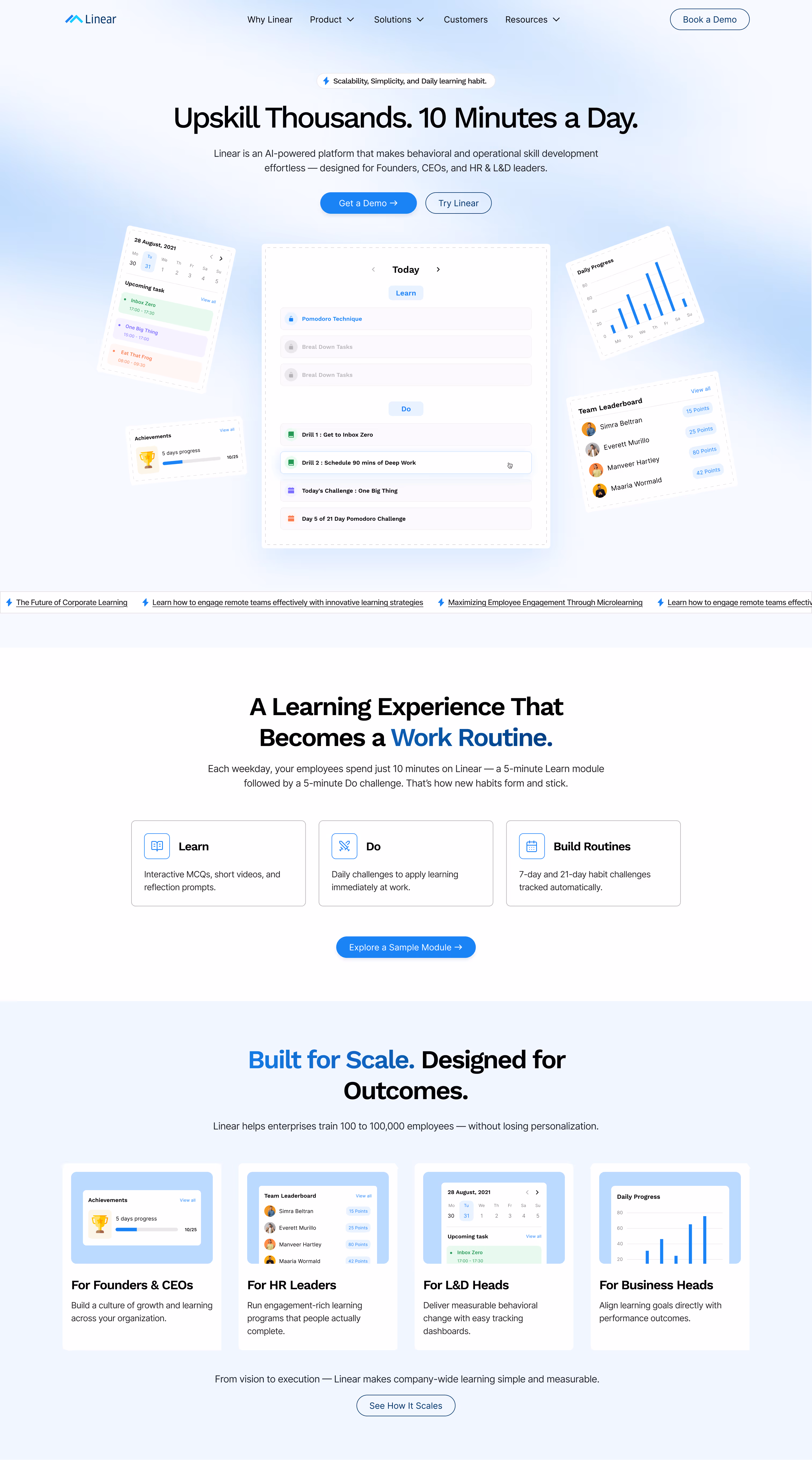
Section #2: The Product Explanation Section
Many SaaS websites assume visitors already understand the product.
But the reality is that most visitors are encountering it for the first time.
If your website doesn’t clearly explain how the product works, users won’t feel confident starting a trial.
The goal of this section is simple:
Explain what the product does, how it works, and why it matters.
The best SaaS websites use a simple storytelling structure.
For example:
Step 1: Import your data
Step 2: Automate workflows
Step 3: Track performance
This approach makes the product feel easy and understandable.
Visuals also play a major role here.
Effective formats include:
- product screenshots
- short UI walkthroughs
- animated feature highlights
- interactive product demos
Remember, visitors don’t want to read paragraphs of explanation.
They want to see how the product works quickly.
If someone cannot understand your product within 30 seconds, they’re unlikely to start a trial.
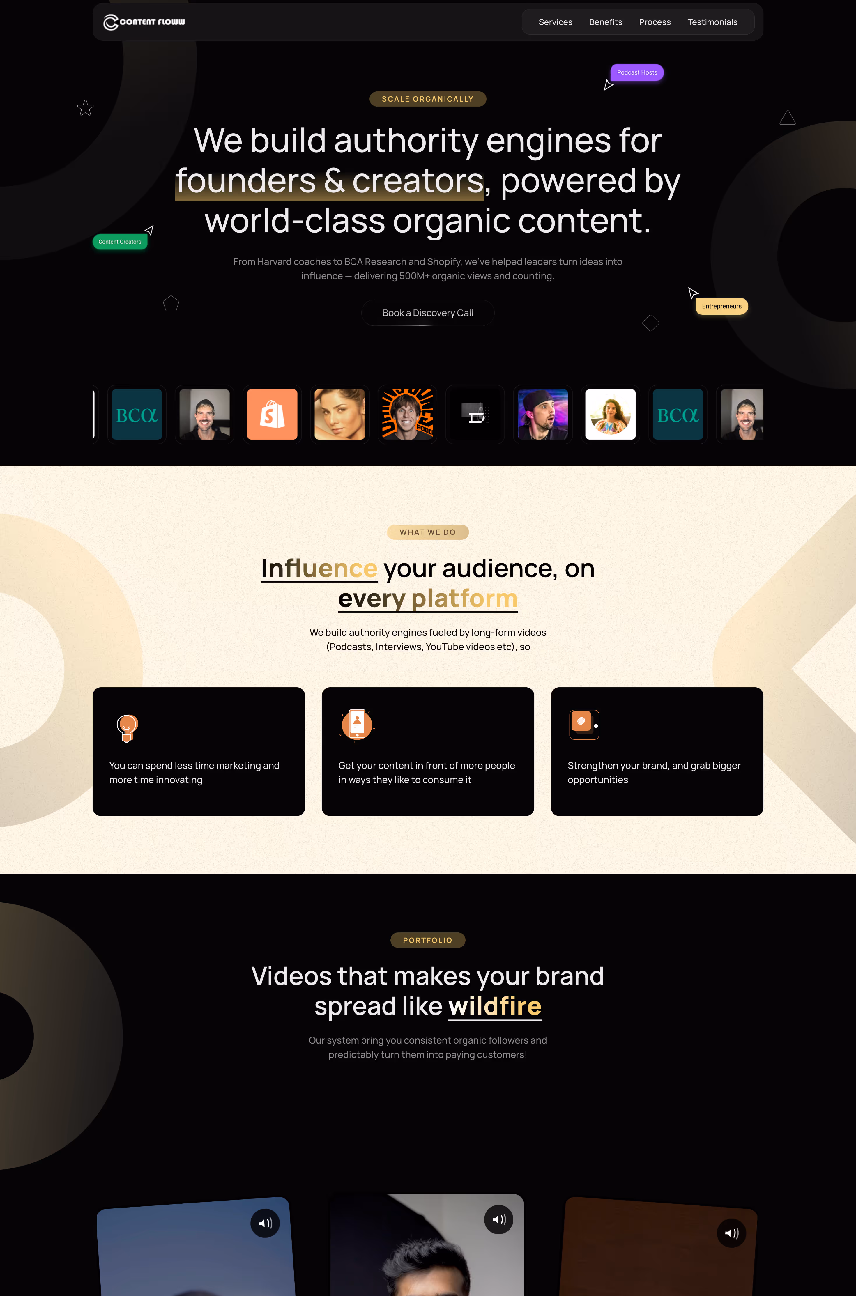
Section #3: Social Proof (Trust Builder)
Trust is one of the biggest drivers of SaaS conversions.
When visitors land on your website, they’re usually asking themselves a few questions:
- Is this product credible?
- Do other companies use it?
- Can I trust this team?
This is where social proof becomes critical.
Strong SaaS websites include multiple forms of social proof.
Customer Logos
A row of recognizable customer logos instantly increases credibility.
Many successful SaaS companies highlight companies they work with directly under the hero section.
Even smaller brands can work well if they are relevant to your audience.
Testimonials
Short testimonials showing specific results are powerful.
Example:
“Using this tool reduced our onboarding time by 60%.”
Notice that the testimonial focuses on outcomes, not praise.
Case Studies
Mini case studies showing how a customer improved their results can also increase conversions.
Even a short two-line story can make a big difference.
Usage Metrics
Numbers also build trust.
Examples include:
- 20,000+ teams use this platform
- 4 million tasks automated monthly
- 150+ companies onboarded this year
These signals reassure visitors that the product is proven.
One important tip: don’t hide social proof at the bottom of the page.
Place it early in the experience so visitors see it quickly.
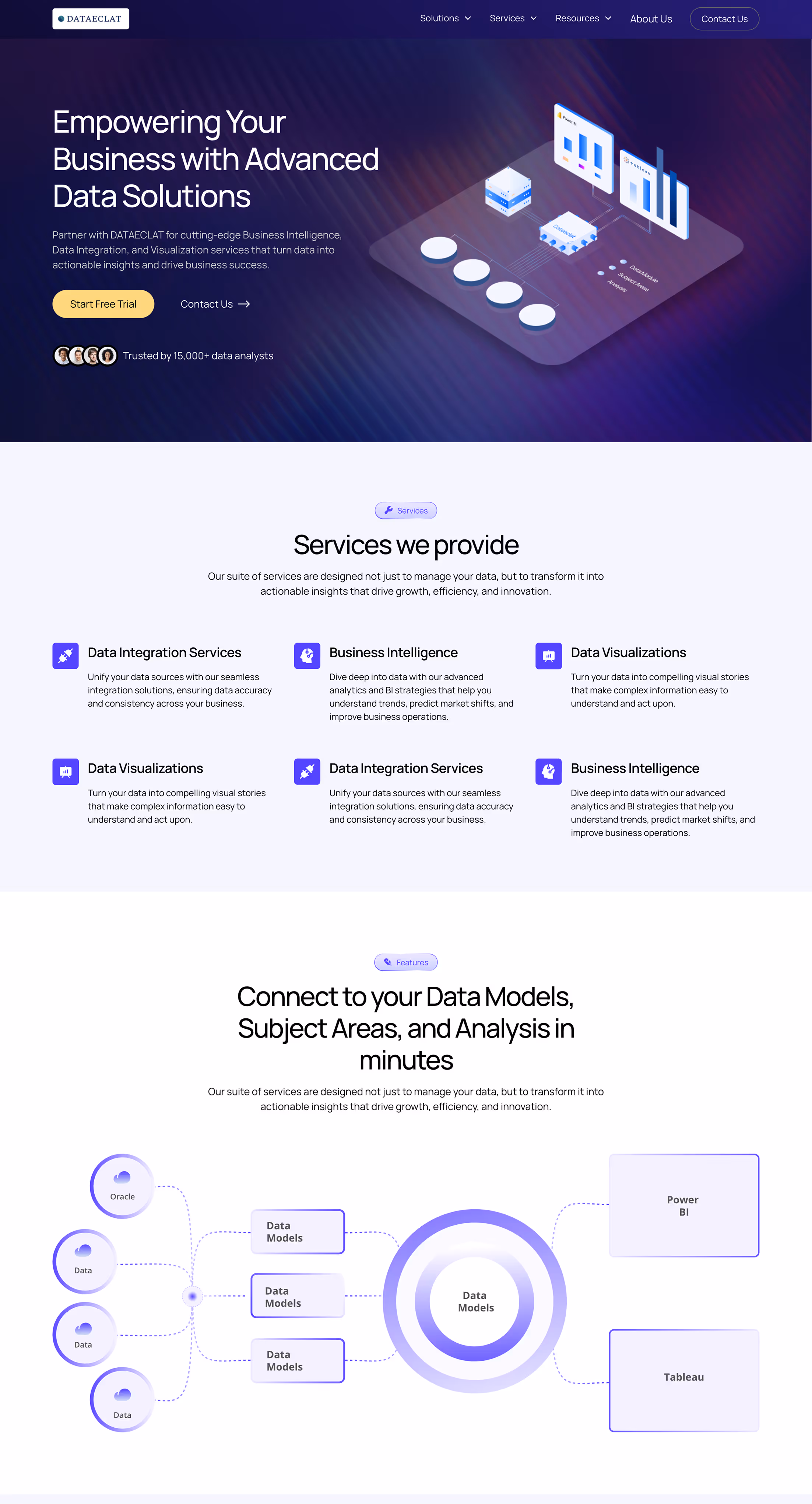
Section #4: The Feature and Benefits Section
Most SaaS websites include a feature section.
Unfortunately, many of them present features in a way that doesn’t drive conversions.
The biggest mistake is focusing only on what the product does, instead of what it helps users achieve.
Let’s look at an example.
Feature-focused copy:
“Real-time analytics dashboard.”
Outcome-focused copy:
“See customer behavior instantly so you can identify drop-offs and improve conversions faster.”
The second version connects the feature to a real benefit.
A good structure for this section is:
Feature → Outcome
Example:
Automation workflows
Save hours of manual work each week.
Team collaboration tools
Keep your entire team aligned in one shared workspace.
Real-time analytics
Identify user drop-offs and improve product adoption.
From a design perspective, this section should be easy to scan.
Good practices include:
- icons for each feature
- short headlines
- concise descriptions
- clear visual hierarchy
Remember that website visitors rarely read every line.
They scan quickly and look for signals that the product solves their problem.
Section #5: The Conversion CTA Section
Even if your website successfully convinces visitors, the final step is making it easy for them to take action.
This is where many SaaS websites fail.
Common issues include:
- weak call-to-action text
- too many competing options
- unclear next steps
- the CTA only appearing once at the bottom
A high-performing CTA section usually includes three elements.
A Benefit-Focused Headline
Reinforce the value of starting a trial.
Example:
“Start Automating Your Workflows Today”
A Friction-Reducing Subheadline
Address common concerns.
Example:
“No credit card required. Get started in minutes.”
A Clear Primary CTA
Examples include:
- Start free trial
- Try it free
- Get started
The key is clarity.
Visitors should immediately understand what happens after clicking.
Another important strategy is repeating the CTA throughout the page.
Most SaaS websites include CTAs in several places:
- the hero section
- after product explanations
- near testimonials
- at the end of the page
This ensures users can convert whenever they’re ready.
How to Quickly Audit Your SaaS Website
If your website isn’t converting as well as expected, try a quick audit using these questions:
- Does your hero section clearly explain what the product does?
- Can visitors understand your product in under 30 seconds?
- Do you show credible social proof early on the page?
- Are your features connected to real benefits?
- Is your call-to-action clear and repeated multiple times?
If the answer to several of these questions is no, your website may be holding back your growth.
Improving these sections can significantly increase trial signups without increasing traffic.
Final Thoughts
When SaaS founders want to increase conversions, they often focus on generating more traffic.
They experiment with:
- new marketing channels
- advertising campaigns
- SEO strategies
But sometimes the biggest opportunity lies in improving the website itself.
A well-structured SaaS website doesn’t overwhelm visitors with information.
Instead, it clearly answers three questions:
- What does this product do?
- Why should I trust it?
- What should I do next?
When these answers are obvious, trial signups become much easier.
Even small improvements to the right sections can have a major impact on conversions.
Ready to turn your website into a reliable growth channel?
If your SaaS website is getting traffic but not converting visitors into trial users, it might be time to look at how your website is structured.
At Missing Piece Studio, we help SaaS companies design websites that clearly explain their product and drive more signups.